(Updated January 2018)
I had an interesting experience when I began to look seriously at our retirement savings and how they might work to fund our retirement. My wife and I had both been saving for a long time, so had sufficient funds to be able to retire at some point in the not too distant future, but exactly when and how well we’d be able to live in retirement was still an open question – were we going to have to cut back a bit, or be able to do a bit more? When I first started investigating in about 2012, we weren’t planning to retire for another few years, and various retirement-investigation models all indicated that we would have enough to maintain our current lifestyle, maybe cutting back a bit to account for higher medical insurance costs. This was reassuring, so we continued investing as before, started tracking our expenses more carefully with the Mint program, and did some investigation of various retirement withdrawal management schemes (see the articles on the Guyton-Klinger withdrawal scheme and ways to assess the effectiveness of different schemes).
The various models we consulted (FIRECalc, cFIREsim, Vanguard’s retirement nest egg calculator, among others) used historical data in sequential and randomized simulations to determine what would happen to our portfolio both in the (relatively short) period before we planned to retire and in the period during retirement when we would be withdrawing. These gave an indication that we were on track, providing a statistical estimate of where our portfolio would be at retirement and how it would fare subsequently. As is often the case, the market had some ideas of its own, and our portfolio did quite well over the next few years. When I began honing in on a retirement strategy (when, how much, etc.), I was pleasantly surprised to find that we had more than I had anticipated, and the models indicated we could withdraw more than we had been expecting when we reviewed a few years earlier.
However, I’m naturally skeptical, and began thinking about whether the new portfolio balance was “real” or “imaginary” – i.e., was this just an inflated value due to a bubble, or was this a reasonable value to base our planning on? Was our current portfolio over-valued, under-valued, or roughly par?
Since this was in 2016, there was some rationale for each viewpoint. The market had grown tremendously from 2012 through 2014, so this might suggest the current value was inflated and due for a correction (some of which came in 2015). But part of the reason for the rapid growth in this period was to make up for the crisis in 2008-2009, when the market lost a huge chunk of its value. Thus the portfolio might still be under-valued from a long-term perspective, or maybe back to what would be expected after the recent growth filled in the “hole” created by the crash.
Looking at the Present from the Past: Historical Average Returns
This led me to look into ways to assess in general whether a portfolio and the market is over- or under-valued at a particular point in time. One thing I’d always done was to look at long-term trends, and see where the market was relative to what would be expected using the long-term average growth rate. Overlaying a smooth long-term-rate graph on top of the actual market graph can help to show where there’s a bubble, the inevitable crash following a bubble, and when the market has recovered to something like its “steady state”.
The graph below shows this for the S&P500, using dividend reinvestment and inflation adjustment and the long-term after-inflation growth rate of 6.8%. Values for the S&P500 price, dividends, and inflation come from Robert Schiller’s great data set, giving information from 1871 to the present. The blue graph shows the compounded value of the S&P 500 index (or its equivalent for earlier periods – see Schiller’s website for specifics), for an initial investment of $1 in 1871, with dividends reinvested and adjusted for inflation. The smooth orange graph shows the same for a $1 investment, but growing smoothly at the average (inflation-adjusted dividend-reinvested) rate over the period from 1871 to the present, which is approximately 6.8 percent.
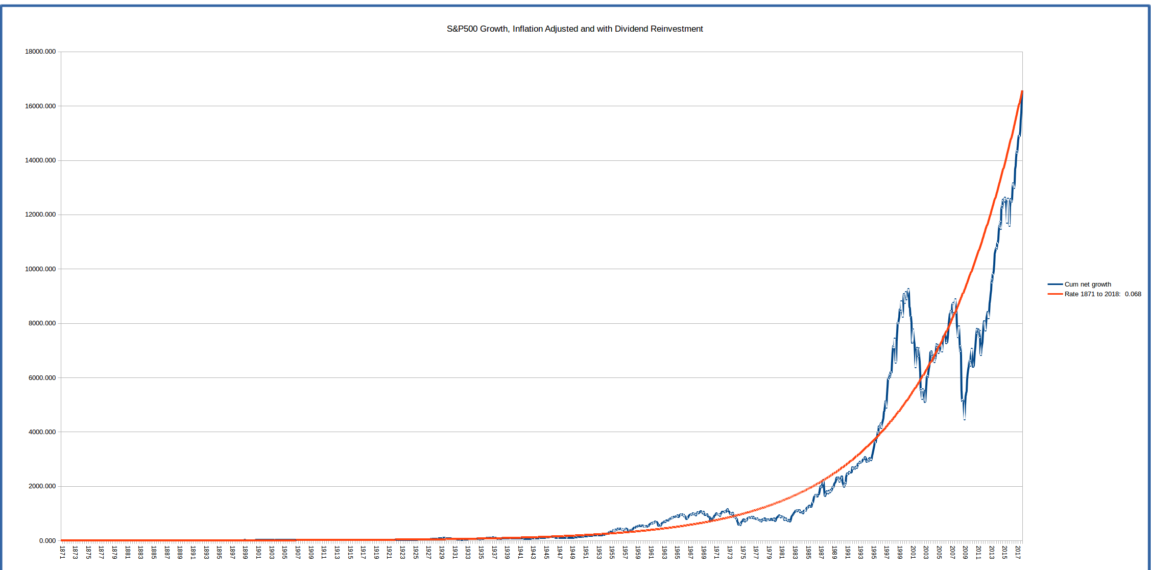
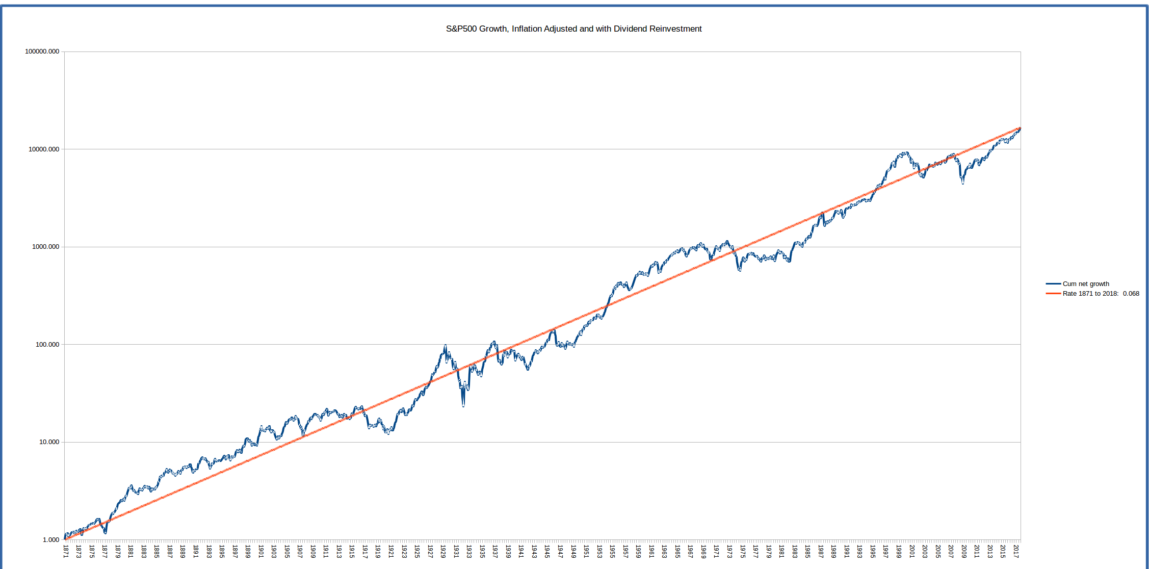
This graph makes it easy to see the various bubble-and-crash cycles, including the tech and housing bubbles in 2000 and 2007. But due to the nature of exponential growth, the early information is swamped by the latest data, so below is the same graph but using a logarithmic scale. The long-term constant rate curve is now a line, and it’s easy to see when the market has been above or below, for both recent times and earlier periods. The market crash of 1929 is now clearly visible as the sharp drop from a sharp peak – the bust following a bubble. And the 50’s and 60’s show up as a “hump” representing a long period of above-average growth.
There are some of limitations with the above graphs. One in particular is that by using the long-term growth rate from 1871 to the present, and starting in 1871, we’re forcing the constant-rate graph to pass through the beginning and end points of the S&P500 curve. This then makes it look like the present is “normal”: it looks like the current market value is exactly where it should be from a long-term perspective, hiding whether there’s currently a bubble or a crash. If we had done this assessment for the period from 1871 to 2000, at the peak of the tech bubble, then the orange line would pass through the tech peak and the current market value would look quite undervalued, whereas is we had done this in 2008, at the depth of the housing crash, we’d look quite good today.
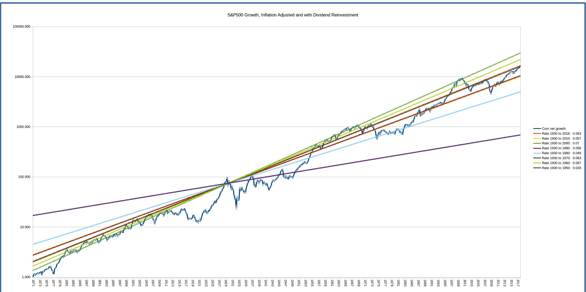
The graph below takes this into account by showing the trend lines for the long-term average rate from 1871 to the beginning of each decade from 1950 to the present, overlaid on the S&P500 graph and extrapolated to the present. We then have a set of long-term rates to compare with, including those ending in bubbles and busts.
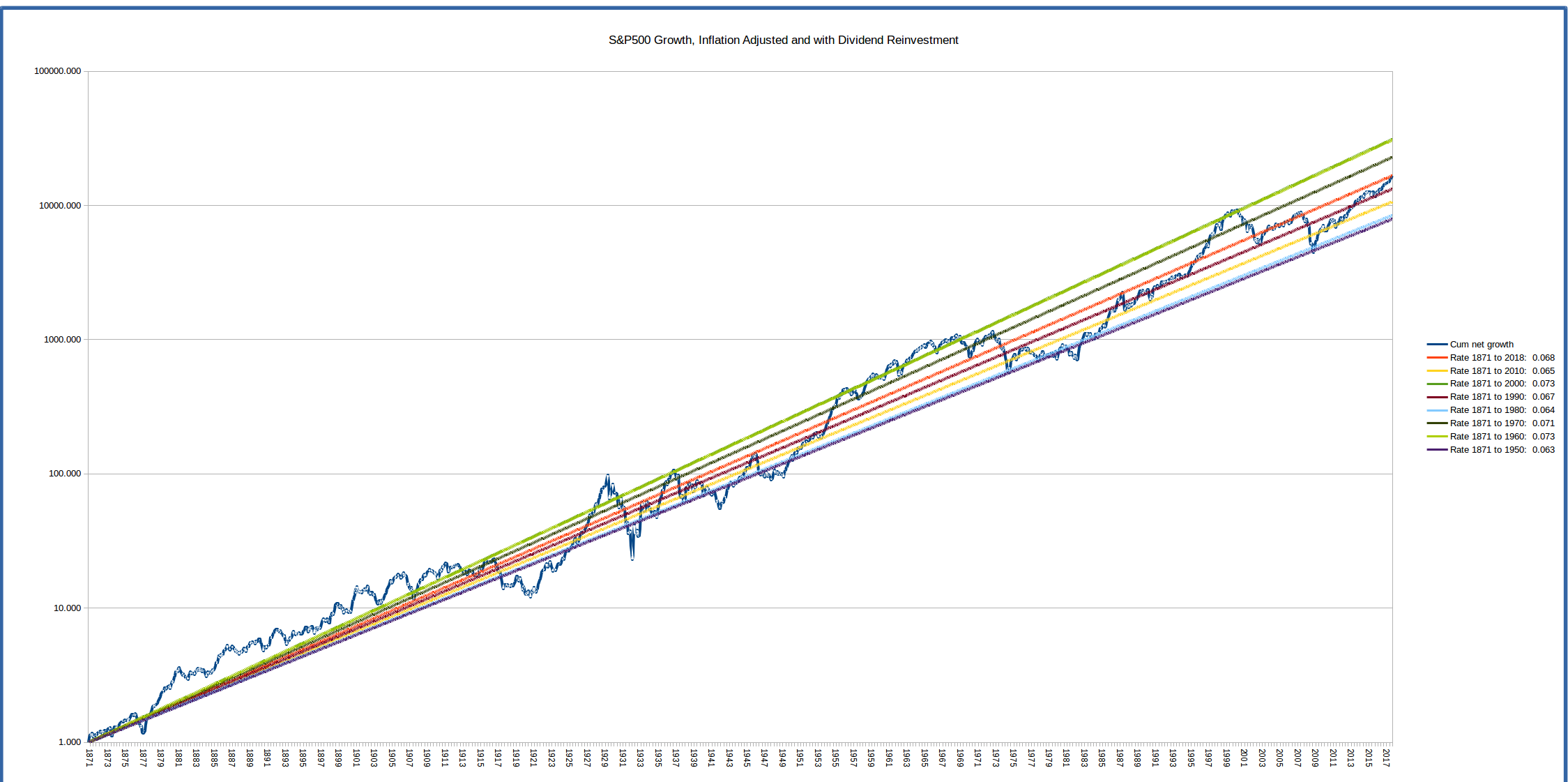
This gives an “envelope” of trend lines that we can use to judge where the market is today relative to predictions we might have made using the long-term growth rates that we would have computed in 1950 or 1990. The various slopes reflect whether we were computing after a bull market, as in 1960 or 2000, when we were at a peak which pushed the long-term growth rate up, or after a downturn like 1980, when we were in a trough that suppressed the average growth rate.
From this perspective, the current (early 2018) S&P 500 market value looks a bit above average; it’s somewhat above the middle of the fan of growth curves.
The above compensates for the “bias of the present” by looking at growth rates computed for earlier periods. An additional bias is introduced by the choice of starting date. We’re using 1871 because that’s the earliest date provided by Schiller’s data. But if that was a market peak or trough, that would affect the overall growth rate by kicking the lines up or down. We can compensate for this by selecting different start dates as well as end dates.
The graphs below show the long-term average growth lines for starting dates from 1900 through 1960 to end dates from 1950 to the present.
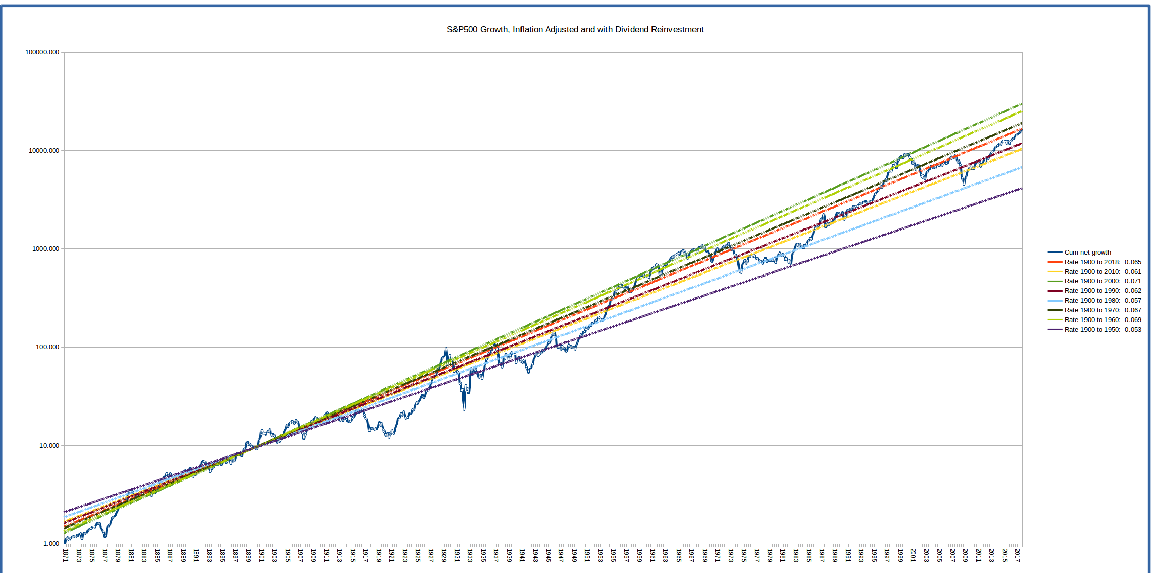


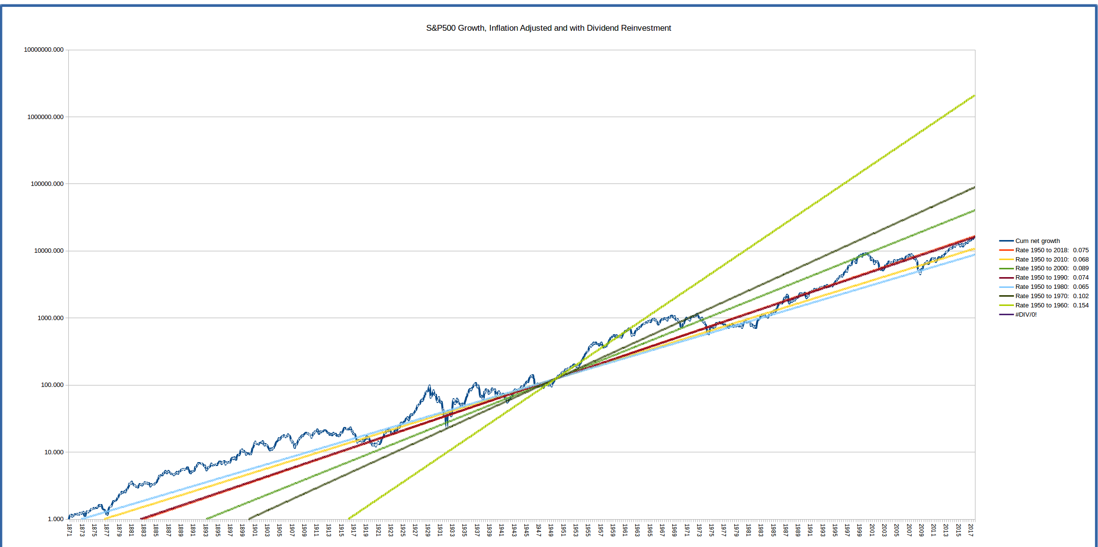
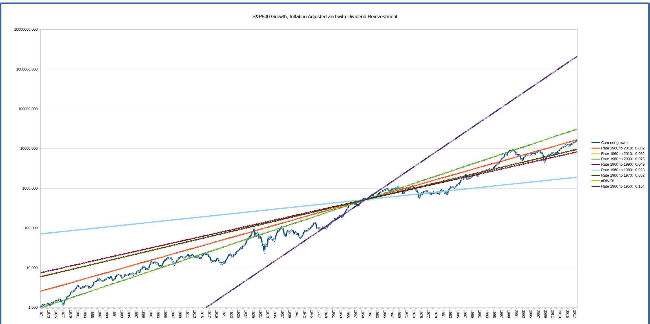
You can see that depending on the start date, the present market value can again look over- or under-valued with respect to the “fan” of long-term averages. The good news is that we know the past, and can interpret based on that. The growth lines starting in 1930, for example, are based on the market value in January of that year; while it had dropped since its 1929 peak, it was still overvalued at that point, so the growth lines have been “kicked up” “abnormally” at the start to make the overall growth less over the periods for which it’s being computed. Those starting in 1920 are starting in a trough, and thus predict a higher growth rate than is probably reasonable.
Overall, the conclusion looks similar to that drawn from the growth lines starting in 1871: in general, the market looks somewhat, though not severely, overvalued.
Another View: Running Average Returns
The above can give some visual indication of where the market is today with respect to where we might expect it to be from long-term trend data. As such, we can make a rough guess of whether we should consider our portfolio at present to be somewhat over- or under-valued, and thus likely to grow at a slower or faster rate than average.
To get a better feel for where we are in any trend, boom or bust, its useful to look at the annualized returns over various running periods. The graph below shows annualized S&P 500 growth rates (dividend-reinvested and inflation-adjusted) for 1-, 5-, 10-, 20- and 30-year running periods from 1901 to the present. (We choose 1901 as our starting point because we’re using running 30-year periods and the data set starts in 1871.) The curves for the 1-, 3- and 5-year periods are in very light colors, as we want to focus on longer-term trends. The averages for the 10-, 20- and 30-year spans are indicated by the horizontal lines. The 30-year running average has the least variation, as expected, since it averages over a 30-year period.
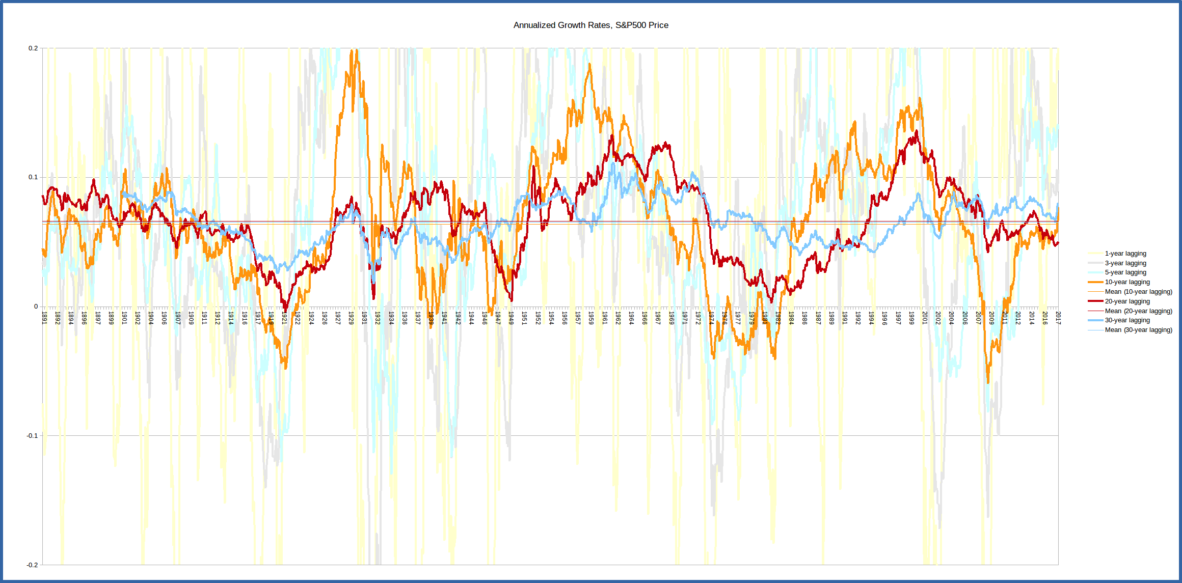
This again helps identify the boom and bust cycles of the past, and compares current performance against the average. We can see that the 10- and 30-year running-average returns are in early 2018 about a percent and a half above their long-term averages (7.7% at the end of 2017 vs 6.4% long-term for the 10-year, and 7.9% vs 6.5% for the 30-year), while the 20-year is about a percent and a half below the long-term average (5.0% at the end of 2017 vs 6.5% long-term).
What does this tell us about our portfolio value at present? What does it mean that the market looks overvalued from a 10-year and 30-year running-average perspective but a bit undervalued from a 20-year perspective? Does this mean that we’ll do well over the next 10 and 30 years but less well over 20 years? Almost, or maybe better put, maybe – we might statistically expect that, but with a large margin of error.
Looking Forward: Lagging and Leading Returns
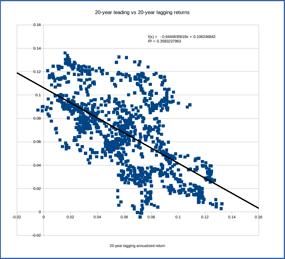
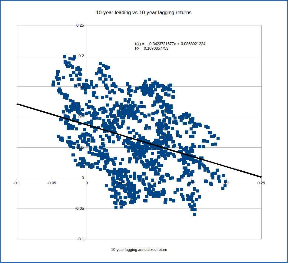
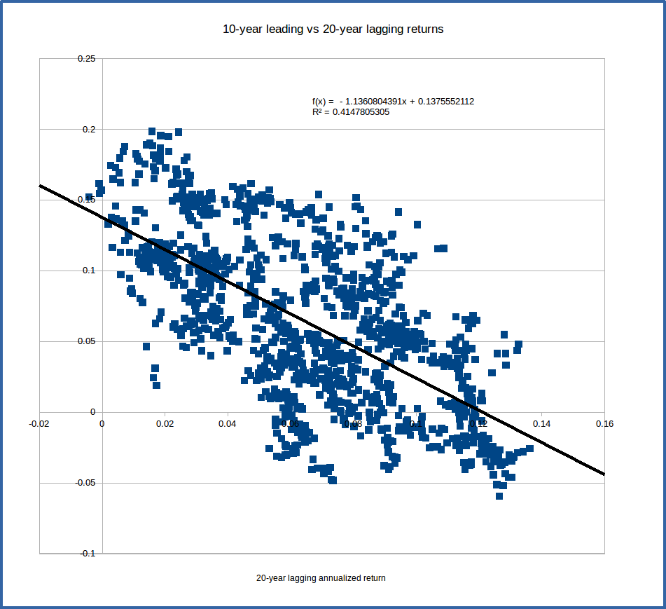
To study this, we can look at the relationship between annualized returns for leading and lagging periods. The lagging 30-year annualized return for any given date is the annualized return over the previous 30 year period, which is exactly what we’re showing in the graph above (and same for the 20- and 10-year lagging returns). The leading 30-year annualized return for a date is that calculated over the following 30 years, using future values for the S&P 500. Obviously we can only do this up to 1986, since we need the subsequent 30 years of data to do the computation. The graph for this would be exactly the graph above, but shifted horizontally by 30 years since the 30-year lagging period for 1995 is the 30-year leading period for 1965. Rather than looking at the graphs, we’ll look at the relationship between the lagging and leading annualized returns for each date – i.e., how does the value of the 30-year lagging annualized return for each year compare with its 30-year leading annualized return? What we’re trying to do is see if the performance over the previous 30 years will indicate what the performance is likely to be over the following 30 years.
The graphs below show plots of points whose coordinates are lagging return (x) and leading return (y) for dates up to 1985. Looking at the points, we can see a general trend in each: when the lagging return is higher, the leading return tends to be lower. This suggests that when our lagging 30-year return is above average, as it is slightly in early 2016, we might expect the leading 30-year return to be slightly below average. Similarly, with the return over the previous 10 years and 20 years being a bit below average, we might anticipate the return over the next 10 and 20 years years to be a bit above average.
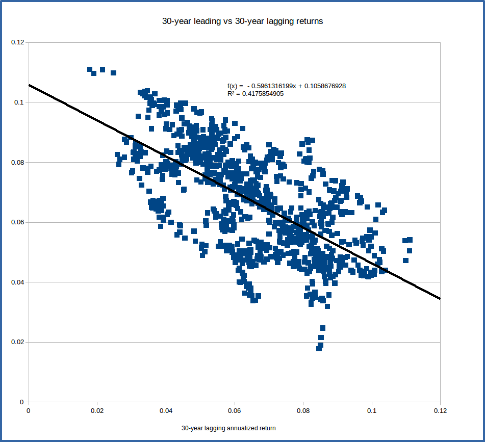
Of course, as the graphs show, there’s by no means a deterministic relationship – there are lots of points where the lagging 30-year return and leading 30-year return are both above average or both below average. There’s a general downward trend, but a broad range of actual results. The linear regression formula indicated on the graph is the “best fit” line; it’s the best estimate for the leading return given the value of the lagging return. The formula predicts a 5.9% leading return given a 7.9% lagging return, but if we look at the data points corresponding to a 30-year lagging return of about 7%, we can see that there are points corresponding to leading returns anywhere from about 3% to about 9%. Thus we might be tempted to say that from this data, we might anticipate the 30-year annualized return going forward to be something like 6% +/- 3%. That’s a pretty broad range.
The Strength of the Lagging-Leading Relationship
To get a quantitative measure of the relationship, we can compute the correlation between the lagging and leading returns. The correlation between the 30-year lagging and the 30-year leading annualized returns tells us the strength of the relationship between the average returns from the previous 30 years and the next 30 years. The correlation coefficient is a value computed from the data that ranges from -1 to 1, and tells us whether and how the lagging and leading returns tend to be related to each other. If the correlation is positive, the lagging and leading returns tend to tend to move together (when one’s above average, so is the other); when it’s negative, they tend to move apart (when one’s above average the other tends to be below average); and when it’s near zero, they tend to be independent (no real relationship). The strength of the correlation is indicated by how close it is to -1 or 1; the closer it is to either of these extremes, the more the values tend to move in lockstep – when one’s up, we can be pretty certain that the other will be up (positive correlation) or down (negative correlation). There will of course be some variation, so for some cases the trend may not hold, but for the majority of cases we’ll see this “correlated” behavior. When the value’s closer to zero, say between -0.25 and 0.25, the relationship is much weaker. For example, if the correlation is -0.20, there will be a weak trend such that if one is up the other will on average tend to be down, but there will be lots of variation in the data, including many points where both will be up or down. So strong correlations, near 1 or -1, give us more reliable predictive information (though still not certainty).
The table below gives correlations between 10-, 20- and 30-year lagging and 10-, 20- and 30-year leading annualized returns. The table includes all the combinations of these, such as the 20-year leading returns with the 10-year lagging returns.
Correlation Coefficient, Lagging-Leading
| Leading | ||||
| Years | 30 | 20 | 10 | |
| Lagging | 30 | -0.65 | -0.53 | -0.48 |
| 20 | -0.45 | -0.60 | -0.64 | |
| 10 | -0.43 | -0.65 | -0.33 | |
Corroborating what we saw in the graphs, the 30-year lagging/30-year leading and 20-year lagging-leading returns are moderately negatively correlated – when the lagging value is up, the leading value tends to be down. The 10-year lagging-leading relationship is significantly weaker, as indicated by the correlation of only -0.33. You can see this in the data plot for the 10-10 lag-lead – the points don’t show as strong a downward trend as in the 30-30 plot, being more diffusely distributed.
Interestingly, the 10-year leading returns are significantly more strongly correlated with the 20-year lagging returns than with the 10-year lagging returns – i.e., the performance over the next 10 years has historically more closely followed the performance over the previous 20 years than the previous 10 years. This is apparent in the values for the correlation coefficient in the table above, as well as in the graph above of 10-year leading vs 20-year lagging returns, which shows a tighter clustering and stronger downward trend. Similarly, the 20-year leading returns are moderately correlated with the 10-year lagging returns.
R2, Coefficient of Determination, Lagging-Leading
| Leading | ||||
| Years | 30 | 20 | 10 | |
| Lagging | 30 | 0.42 | 0.28 | 0.23 |
| 20 | 0.20 | 0.36 | 0.41 | |
| 10 | 0.18 | 0.43 | 0.11 | |
A quantity directly related to the correlation coefficient is its square, called the coefficient of determination and denoted r2. This is shown in the second table above (as well as below the formulas for the linear relations shown on the graphs). Since it’s the square of a value that runs from -1 to 1, the value of the coefficient of determination will run from 0 to 1. It has a very nice interpretation: it tells the percent of the variation in the lagging and leading returns that is due to the relationship between them. Thus the value of 0.42 for r2 for the 30-year lag-lead relationship says that about 42% of the value of the leading return can be explained by the value of the lagging return; the other 58% is just random variation. Similarly, we can say that about 36% of the 20-year leading return can be explained by the current value of the lagging return. For the 10-year lag-lead, the value of r2 is just 0.11, which suggests that just 11% of the leading return is explained by the value of the lagging return, which is a pretty weak relationship.
Conclusions
What does all this tell us? From the graphs of total inflation-adjusted return and average growth rate, the market at the end of 2017 looks somewhat over-valued – we’re above where we’d expect to be from the long-term trends, but we don’t appear to (yet) be in a serious bubble. Thus the current portfolio valuation might be a bit over-valued, and it might not be a bad idea to be a bit conservative when choosing e.g. a safe withdrawal rate.
Looking forward, the graphs of 10-, 20- and 30-year lagging annualized returns suggest that we’re a little below average on a 20-year time scale, and above average on a 10-year and 30-year time frame. Given the moderate negative correlation between the lagging and leading annualized returns for the 20- and 30-year time frames, this suggests we might expect slightly above average returns over 20 years, but should perhaps prepare for somewhat less than average returns on a 30-year span. However, we do know something about the past, and the 20-year running average is currently significantly affected by the tech boom of the 90’s. Since we’re starting in 1998, very near the top of the tech boom, we’re missing most of the growth years, but picking up the “crash” years of the early 2000’s. Thus the below-average value for the running 20-year average could be due primarily to timing, picking up the tech-boom trough without integrating the benefit of the tech boom itself.
With the weak correlation between the 10-year leading and lagging returns, it would be hard to say what to expect. But the stronger correlation between the 10-year leading return and 20-year lagging return, and the below-average value for the 20-year lagging return, suggests that there might be slightly above average returns over the next decade. Or not.
Of course, none of this is deterministic. All of the correlations are just moderate, so there’s a very good chance the market may do the opposite of what the statistics indicate. For example, the data plots suggest that with its current value of about 7.9%, the 30-year average return could easily lie anywhere in the range from 3% to 9%, which includes values well below and well above the average. Plus history is often not a good predictor of the future – stuff happens. Markets are heavily influenced by events that can’t be predicted – new technologies that open up whole new areas of growth, political and military conflicts that restrict trade, etc.
Also, this analysis is quite simplistic – it looks just at past market performance, and tries to use that to infer possible future performance, without consideration of any of the business fundamentals like earnings, market shares, competition, costs, and any of the thousands of other things that affect individual businesses and the market as a whole. There are much more sophisticated ways to try to predict the future. Of course, there’s no guarantee that any of them will get it right either. The one thing that analysis of the past does show convincingly is that predictions about the future, especially the financial markets, are usually wrong.
Caveat
This information is presented as-is, with no guarantee as to accuracy or freedom from errors. This document and associated spreadsheet is intended as an observation for informational purposes only, and should not be used in retirement planning without cross-checking and correlating with other sources of information and consultation with a certified financial planner. I’m an enthusiast, not a professional, and being human I make mistakes. Your retirement funding is far too important to rely significantly on any unvalidated information!
Spreadsheet Download
- Spreadsheet used to generate statistics and graphs (OpenOffice/LibreOffice format)
The spreadsheet is open-source software licensed under the Gnu General Public License v2. This gives you the right to use the spreadsheet for your purposes, and adapt it (create a derived work) as you see fit as long as you make the new spreadsheet available for other users. See the link above for license details.
Data source for economic data
U.S. Stock Markets 1871-Present and CAPE Ratio, Robert Schiller, Yale University Department of Economics.
Articles in this series
-
Life Tables and Retirement Planning
-
Retirement Withdrawal Strategies: Guyton-Klinger as a Happy Medium
-
Variable Withdrawal Schemes: Guyton-Klinger, Dynamic Spending, and CAPE-Based
-
Comparing Retirement Withdrawal Schemes: Efficiency, Deficiency, and Disruptiveness
-
Retirement Withdrawal Efficiency Revisited: Variable Lifespan and Annuities
-
Annual or Monthly Withdrawal? Dollar Cost Averaging in Retirement
-
Over-valued, Under-valued, or Just About Right? Assessing Retirement Portfolios in Current Conditions